
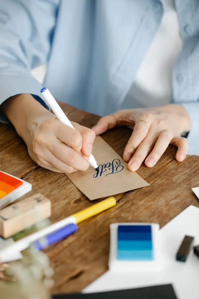
A custom font starts the same way every piece in the studio does: with ink on paper. For our Wren Monoline typeface, that meant more than four hundred hand drawn letters before a single one was digitised.
We draw every lowercase and capital letter several times, then pick the versions that sit best together. Connecting strokes are refined so any two letters can join smoothly, which is what makes a script font feel handwritten rather than stamped.
Each chosen letter is scanned, traced into clean vectors and spaced by eye. Alternates and ligatures are added so repeated letters never look identical, keeping the warmth of a real hand.
The result is a font a brand can use on menus, packaging and websites, while still feeling like a person wrote it just for them.
See more examples in our portfolio, or ask about a font of your own.